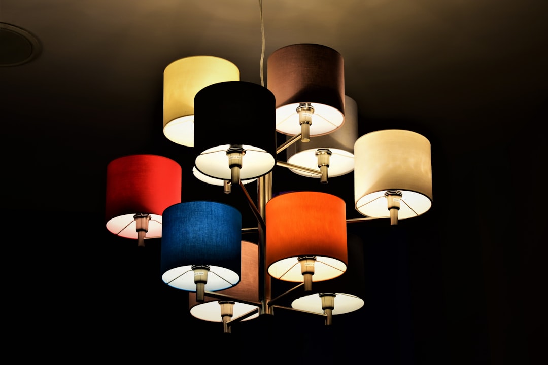
Ever stare at a paint swatch in the store, then get home and realize the color looks completely different on your wall? It’s not your imagination. Often, the culprit isn’t the paint itself, but the light source illuminating it. This is where the “truthful palette” comes in, and it hinges on something called Color Rendering Index, or CRI. Simply put, lamps with a high CRI show you what a color really looks like, unfiltered by the limitations of the light itself.
Understanding the Basics: What is CRI?
So, what exactly is this CRI thing? Think of it as a score, a rating given to a light source that tells us how accurately it reproduces the colors of objects compared to a natural light source, like the sun. The scale runs from 0 to 100. A CRI of 100 is considered perfect; the light source shows colors exactly as they would appear under natural daylight. Anything lower means some colors might appear slightly altered.
The Reference Standard: D65 Daylight
To understand CRI, we need a benchmark. The standard reference for high CRI is a simulation of average daylight at noon, known as D65. This is what nature’s own light source uses, and it’s the gold standard against which artificial lights are measured.
The Scale Explained: From Blurry to Brilliant
- Low CRI (Below 60): Imagine looking at colors through a slightly foggy window. Some hues might be muted, others might lean towards a different shade altogether. You’re not getting the full picture, and colors can look washed out or unnatural.
- Medium CRI (60-80): This is where many common light bulbs fall. They’re okay for general lighting, but they can still subtly distort colors. You might not notice it in everyday tasks, but when precision matters, like choosing paint, it becomes a problem.
- High CRI (80-100): This is the sweet spot for revealing true colors. Lamps Fimull. with a CRI of 80 and above start to get close to natural daylight. When you hit 90 and above, you’re getting a really accurate representation of what that paint color actually is.
Why Does CRI Matter for Paint Colors?
This is where things get really practical for anyone looking to refresh their living space. When you’re selecting paint, you’re trying to choose a color that will create a specific mood, complement your decor, or simply make you happy. The light in the room plays a massive role in how that color presents itself.
The Store vs. Home Dilemma
You see that perfect shade of blue in the paint store. It’s vibrant, it’s calming, it’s exactly what you envisioned. You buy the can, bring it home, and… it looks… different. Maybe it’s a bit more grey, a bit more green, or just… duller. This is a classic case of the light in the store (often designed to be quite neutral and bright) interacting differently with the paint than the light in your home, which might be warmer, cooler, or simply of a lower CRI.
The Impact on Undertones
Every paint color has undertones – subtle hints of other colors within it. A warm white might have yellow or pink undertones, while a cool grey might have blue or green undertones. Low CRI lighting can exaggerate or hide these undertones. A lamp that leans too warm might make a cool grey look muddy, while a lamp that leans cool could make a warm white appear stark. High CRI light allows you to see these undertones clearly, ensuring you pick a color that works with your existing decor and the overall feeling you want to achieve.
Creating the Right Atmosphere
Paint color isn’t just about the hue; it’s about the feeling it evokes. A deep emerald green can be sophisticated and calming, or it can feel oppressive and dark depending on the light. High CRI lighting ensures that when you choose a color for its mood, you’re actually getting that mood. A warm, inviting yellow will truly feel warm and inviting, not like a sickly pale imitation.
The Science Behind the Color Shift: How Lamps Affect Perception
It’s not magic, it’s physics. Light is made up of different wavelengths, and these wavelengths interact with the pigments in your paint. The way a lamp emits these wavelengths determines how we perceive the colors it illuminates.
Spectral Power Distribution (SPD)
Every light source has a Spectral Power Distribution (SPD) curve. This curve shows how much energy the light source emits at each specific wavelength of the visible spectrum. Natural daylight has a relatively smooth and continuous SPD. Many older or cheaper artificial lights have a more uneven SPD, with peaks and dips. These unevenness are where the color distortion comes from.
The Role of Phosphors in LEDs
Most modern LED bulbs use phosphors – chemical compounds that absorb the blue light emitted by the LED chip and re-emit it as different colors. The blend and quality of these phosphors directly influence the SPD of the LED and, consequently, its CRI. High-quality phosphors are crucial for achieving a high CRI.
How We See Color: A Complex Process
Our eyes perceive color when light reflects off an object and enters our eyes. Our brain then interprets the wavelengths of this reflected light. If the light source isn’t providing a full spectrum of wavelengths, or if it’s emphasizing certain wavelengths over others, our brain will interpret the reflected light differently. This is why that red apple might look a bit dull under a low CRI bulb, or a vibrant blue wall could appear muted.
Practical Tips for Choosing High CRI Lighting for Your Home
Knowing about CRI is one thing, but actually applying it can feel like a puzzle. Here’s how to make it work for you, especially when it comes to your paint projects.
Look for the Label: CRI 90+ is Your Goal
When you’re shopping for light bulbs, especially for areas where color accuracy is important (like living rooms, bedrooms, kitchens, and art studios), look for bulbs that explicitly state their CRI. For paint selection and overall accurate color rendering, aim for a CRI of 90 or higher. Some manufacturers might list a «typical» CRI and a «minimum» CRI; aim for the minimum to be 90+.
Understand the «R» Values: A Deeper Dive
CRI is actually a composite of several individual color rendering scores, known as R values (R1 through R15). The overall CRI is an average of the first eight R values (R1-R8), which represent a range of saturated colors. However, for subtle color nuances, the later R values (R9-R15) can be more telling, especially for skin tones (R10) and saturated colors like reds (R9). A high CRI overall is great, but if you want to be truly confident, look for high R9 values too.
Consider the Color Temperature (Kelvin)
While CRI tells you how accurately colors are rendered, color temperature (measured in Kelvin) tells you the warmth or coolness of the light. A warm light (around 2700K-3000K) has a yellowish, cozy feel, similar to incandescent bulbs. A cool light (around 4000K-5000K) is brighter and more neutral, closer to daylight. For paint selection, it’s often best to use a light source with a high CRI and a color temperature that mimics the natural light you expect in the room. For example, if you want to see how a paint looks in natural daylight, use a bulb around 5000K with a CRI of 90+. If you want to see how it looks in the warm light of the evening, use a 2700K bulb with a high CRI.
Different Rooms, Different Needs
- Paint Selection / Art Studio: CRI 95+ is ideal here. You need the absolute best color accuracy.
- Living Rooms / Bedrooms: CRI 90+ will make your decor look its best and create a pleasant ambiance.
- Kitchens: CRI 85-90 is good for general tasks, but higher CRI is better for food presentation and picking out produce.
- Bathrooms: CRI 80+ is often sufficient for grooming, but a higher CRI can make colors look more natural.
Beyond the Bulb: Other Factors Influencing Paint Color
While high CRI lighting is a game-changer, it’s not the only factor affecting how your paint color appears. A holistic approach to understanding color in your space is key.
Natural Light’s Influence
The amount and direction of natural light in a room are huge influences. North-facing rooms tend to get cooler, more consistent light throughout the day. South-facing rooms get warmer, more intense light, especially around midday. East-facing rooms get warm, direct light in the morning that cools down later, while west-facing rooms get intense, warm light in the afternoon and evening. Always test paint samples in the room where they will be used, at different times of day.
Room Finishes and Decor
The color and sheen of your walls, ceiling, and even the floor can bounce light around and affect how paint colors appear. A matte finish absorbs more light, making colors appear darker and more subdued. A satin or semi-gloss finish reflects more light, making colors appear brighter and more vibrant. The colors of your furniture, artwork, and even the texture of your walls all contribute to the overall visual experience.
Artificial Light Source Type and Placement
Beyond CRI and Kelvin, the type of artificial light source matters. Halogen bulbs generally have excellent CRI, but they can be inefficient and produce a lot of heat. Fluorescent bulbs can have varying CRIs, and some older types can cast an unpleasant green or pinkish hue. Incandescent bulbs have a very warm color temperature and good CRI, but are being phased out due to energy inefficiency. LEDs offer the best combination of energy efficiency, longevity, and increasingly, excellent CRI. The placement of your lights also matters – direct downlights will create shadows, while diffused ambient lighting will provide a more even illumination.
Making the Change: Investing in Better Light
Switching to high CRI bulbs might seem like a small detail, but it can make a significant difference in the final appearance of your painted walls and the overall atmosphere of your home. It’s an investment in accuracy and aesthetics.
The Long-Term Savings
While high-quality LED bulbs with high CRI might have a slightly higher upfront cost than basic bulbs, they are far more energy-efficient and last much longer. This means you’ll save money on your electricity bills and won’t have to replace bulbs as frequently. Over time, the cost difference is negligible, and the benefits are substantial.
Where to Start
If you’re planning a painting project, start by swapping out the main light bulbs in the room with high CRI LEDs (90+). Then, purchase a few sample pots of your chosen paint colors and paint large swatches on different walls of the room. Observe these swatches throughout the day and night, under both natural and artificial light. This will give you the most accurate representation of how the color will look in your space.
Beyond Paint: The Broader Impact
The benefits of high CRI lighting extend beyond paint colors. If you have artwork, photographs, or textiles with specific colors that you want to appreciate fully, high CRI lighting will make them shine. It’s also a significant factor for anyone involved in color-critical tasks, such as graphic design, fashion, or makeup artistry.
By understanding and utilizing the concept of CRI, you’re not just choosing a light bulb; you’re choosing to see the world, and your home, in its true colors. It’s about making informed decisions that lead to results you’ll truly love.